BNEXT.NL
Designing a scalable system for both brand storytelling and complex sales
Role: Lead UX Designer
Client: Bnext.nl
Year: 2024
Visit: bnext.nl
summary
The Problem
Bnext.nl’s digital presence was a "boring utility" that failed to reflect its status as a circular economy innovator. Operationally, the business faced a high order error rate: users frequently selected the wrong container sizes or waste types, leading to expensive logistical failures and a heavy burden on customer support.
The Mission
To design a scalable, unified ecosystem that decoupled brand storytelling from transactional complexity. The goal was to transform an ambiguous, manual quoting process into an automated "Decision Engine"—guiding both B2B pros and B2C homeowners to the correct logistical solution.
The Outcome
We engineered a bifurcated UX strategy, deploying a Transactional Webshop (Shopify) and a Corporate Brand Site. By delivering a modular Component Library and a high-intent Navigation System, we empowered the client to scale independently while ensuring a frictionless handoff between "the story" and "the store."
The strategy
One brand, two engines
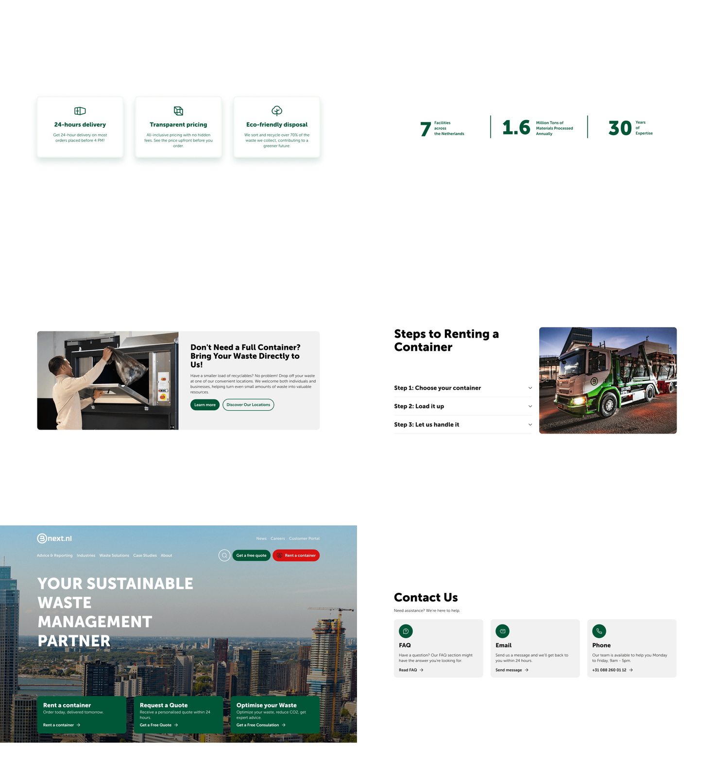
A major part of my strategy was recognising that a "one-size-fits-all" funnel would fail. I architected a dual-track system that separated the brand’s narrative from its transactional engine while maintaining a "single-site" feel.
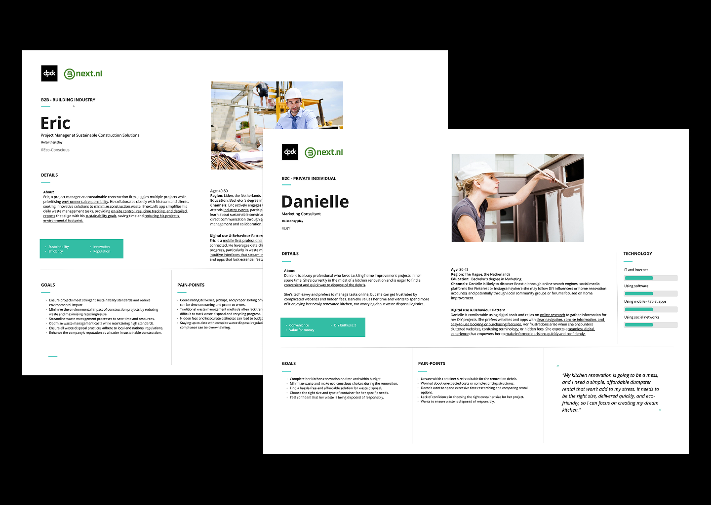
The corporate hub (B2B): focused on trust, sustainability reports, and large-scale enterprise partnerships.
The webshop (B2C): a high-performance Shopify engine optimised for quick container rentals and clear pricing.
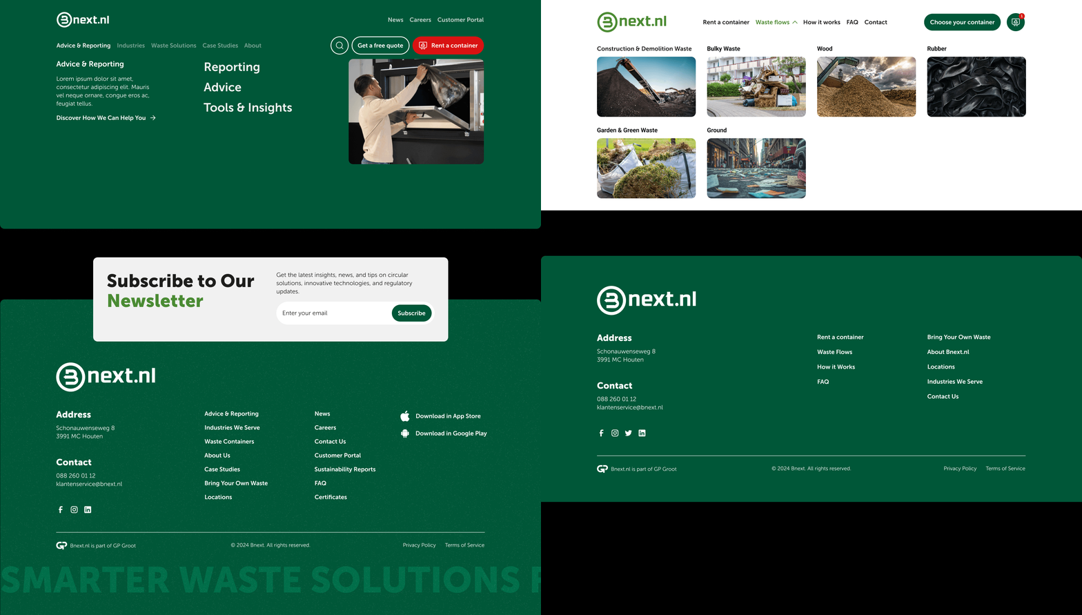
The seamless bridge: I designed a unified global navigation and menu structure that acted as an intelligent router. Whether a user is a construction foreman needing a quote or a homeowner needing a bin, the menu directs them to the right platform without them ever feeling like they’ve left the brand experience.
The approach
A modular component library
To ensure Bnext could grow without constant agency intervention, we didn't just design pages—we delivered a modular design system.
I created a robust library of flexible components used across both the corporate site and the webshop.
This library empowers the Bnext marketing team to build out new high-converting landing pages, blog posts, and service pages independently.
By defining key templates for core pages (Homepage, Service overview and detail pages, product detail pages, etc), we ensured that the user experience remains cohesive even as the site grows.
The vision
Two specialized paths
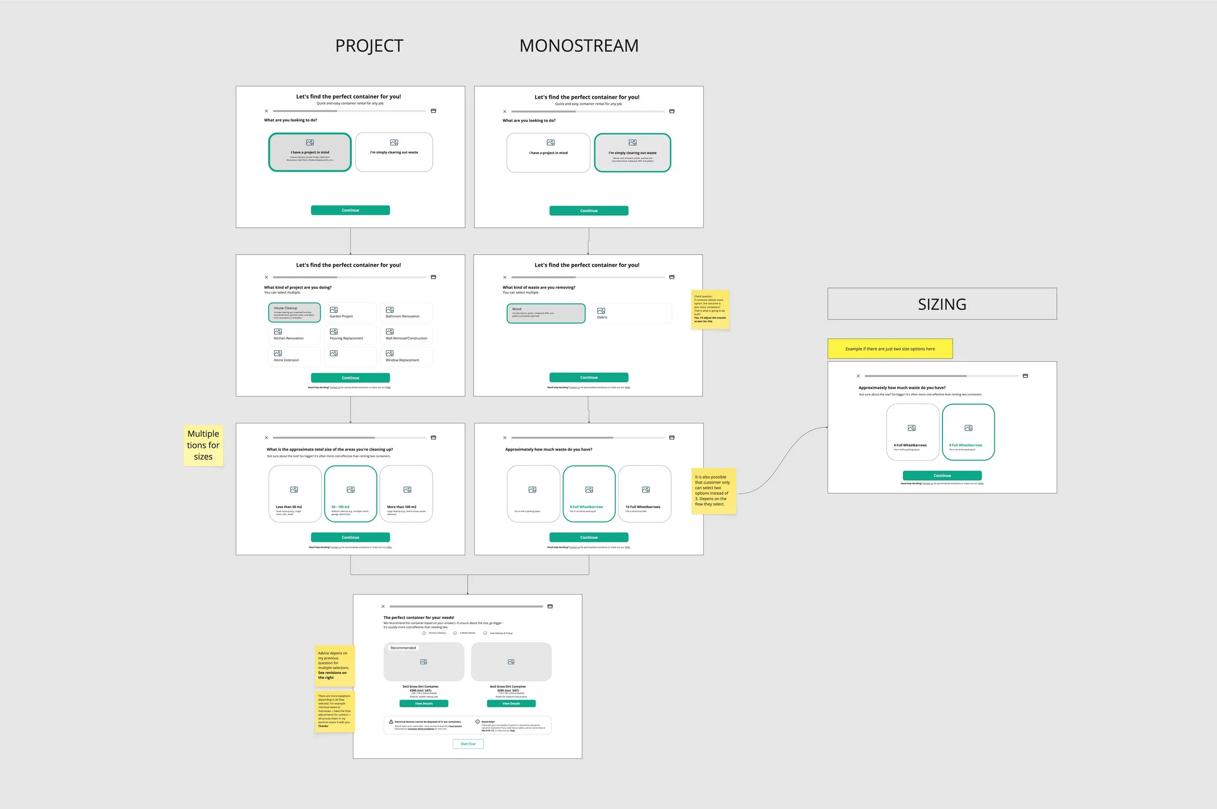
The project’s turning point was transforming Bnext’s manual, complex internal logic into an automated digital experience. Since the client lacked a formalised logic roadmap for pricing and waste regulations, I stepped into a consultative role to define it. Through logic sprints and decision-tree prototyping, I mapped how user inputs - like project type and waste volume - should trigger specific logistical outputs.
To address the distinct procurement behaviours of each market, I designed two specialised selection aids:
The B2C Selection Aid: a project-first wizard designed for instant confidence and fast, consumer-level checkout.
The B2B Quote Builder: a lead-generation tool focused on operational precision and long-term service planning.
The solution
A. The B2C selection aid
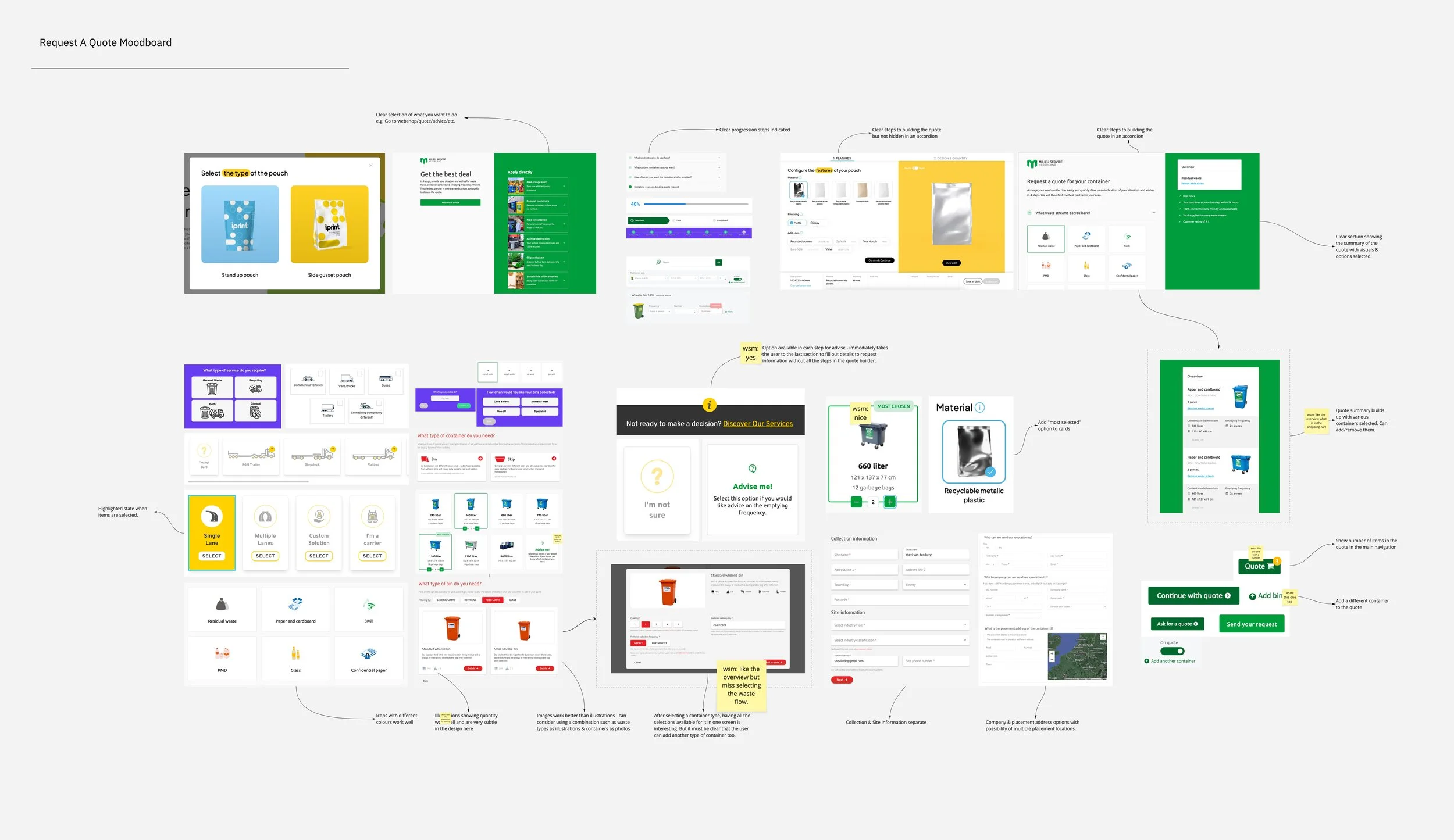
The B2C Selection Aid is about instant confidence. It’s a fast, visual flow designed to help a homeowner click "Rent" in under 5 minutes without fear of making a mistake. Because renting a container is a high-stakes, low-frequency task, most users struggle to visualise volume or understand technical waste categories. This "choice paralysis" was a major conversion barrier, reflected in high bounce rates >40% and long session times.
To solve this, I designed a step-by-step recommendation engine that shifted the experience from browsing a catalogue to describing a project. By translating complex logistics into human-scale analogies—like wheelbarrows and parking spaces—we removed the guesswork and made finding the right container the easiest part of the user's job.
The thinking behind the Selection Aid
1. Making size easy to visualise. Most people can't picture a cubic meter. To help users choose the right container, I used relatable, real-world measurements. Small jobs are measured in wheelbarrows (something you can hold), and large jobs are measured in parking spaces (something you can see on your driveway). This removed guesswork and reduced "sizing fear," leading to faster checkouts and fewer support calls.
2. The "go bigger" nudge. We added a strategic tip: If you're unsure, size up. One large container is much cheaper than renting two small ones. This increased the average order value for the business while saving customers from a 100% markup on a second delivery.
3. Stopping mistakes before they happen. Heavy waste (like tiles) in a large bin can make it too heavy for a truck to legally lift. I built in automatic warnings. If a user selects a 9m3 bin for tiles, the system flags it as "too heavy" instantly. This prevented operational friction—eliminating rejected pickups, transport fines, and frustrated customers.
Results: the complex decision-making process was now as easy to complete on a smartphone as on a desktop, directly supporting our goal of keeping mobile conversion within 10–15% of desktop performance.
The solution
B. the B2B custom quote builder
Business users need to manage multiple sites and recurring schedules. The focus here is on flexibility and long-term planning rather than a quick transaction.
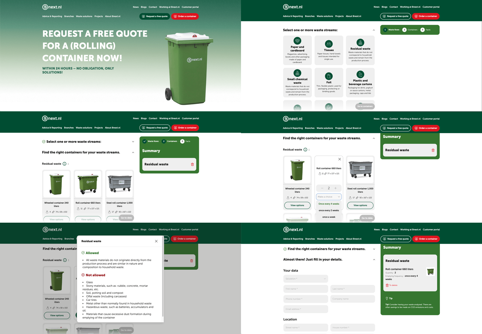
I replaced the generic contact form with a custom quote builder that allows businesses to build their own service profile. This ensures the sales team enters the first call with a full logistical breakdown, shifting their role from order takers to strategic consultants.
The thinking behind the Custom Quote Builder
1. Managing multi-stream complexity. Business projects often produce several types of waste at once. I designed a flow that lets users select multiple waste streams and set different pickup frequencies (e.g., "every 2 weeks") for each. This captures the entire project’s scope in a single request.
2. Consulting on sustainability. Corporate users need to hit ESG and budget targets. I added a tip suggesting waste analysis for CO2 and cost savings. This positions Bnext.nl as a partner that helps their business become more efficient, rather than just a vendor.
3. Shortening the sales cycle. By collecting exact location details, quantities, and desired start dates upfront, we eliminated the usual back-and-forth emails. This provides the sales team with high-intent, fully qualified leads ready to be closed immediately.
Results: The success of this tool is measured by the reduction in sales touchpoints and an increase in multi-service B2B contracts. By qualifying the lead through the design, we aim to transform the sales team from order-takers into strategic partners.
ReFLECTIONS
Ultimately, we delivered more than a website—we handed over a system built for the future of the circular economy. Operationally, the robust component library gave the Bnext team complete freedom to manage content without developer oversight. For the users, seamlessly linking the corporate and webshop environments meant the journey from "search to checkout" became a straight line, completely free of friction.
The biggest takeaway for me was the sheer impact of choice architecture. By automating the complex logistical decisions users previously had to make manually, we turned a confusing chore into a premium digital service. It was a great reminder that good UX can elevate any industry, proving that even managing "trash" can—and should—be a seamless, high-end experience.